

Home Charging App
Designing a Calm and Responsive EV Experience from the Ground Up
Overview
We designed an innovative EV charging app from the ground up — tailored for individuals and families navigating the shift to electric mobility.
As expectations grew around transparency, control, and ease of use, our goal was clear: simplify a complex system into an intuitive, trustworthy experience.
The app launched on iOS and Android, with continuous improvements shaped by user feedback.
What I Led
Role: Chief UX Designer
Defined the UX vision from zero
Led end-to-end flow and UI design for iOS & Android
Turned vague early requirements into actionable user insights
Started building a scalable, state-based component system
Mentored a junior designer and aligned cross-regional teams around a shared experience model
The Challenge
Designing a reliable EV charging experience came with three key challenges:
Bridging teams and assumptions
Teams in China and Europe had different expectations — closing gaps required constant design advocacy.
Complex IoT environment
Multi-channel connectivity (Bluetooth, Wi-Fi, cloud) made syncing and error handling tricky.
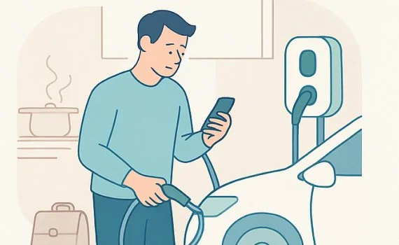
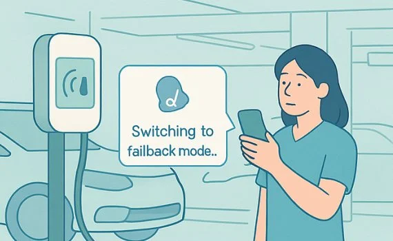
Invisible interactions
Charging happens in the background — users still needed to feel informed and in control.
Team: EU marketing + CN product, engineering & hardware
Timeline: 2–3 months for MVP, followed by iterative releases
Design: Irene Zhang (Lead), +1 Junior Designer

Insight Discovery
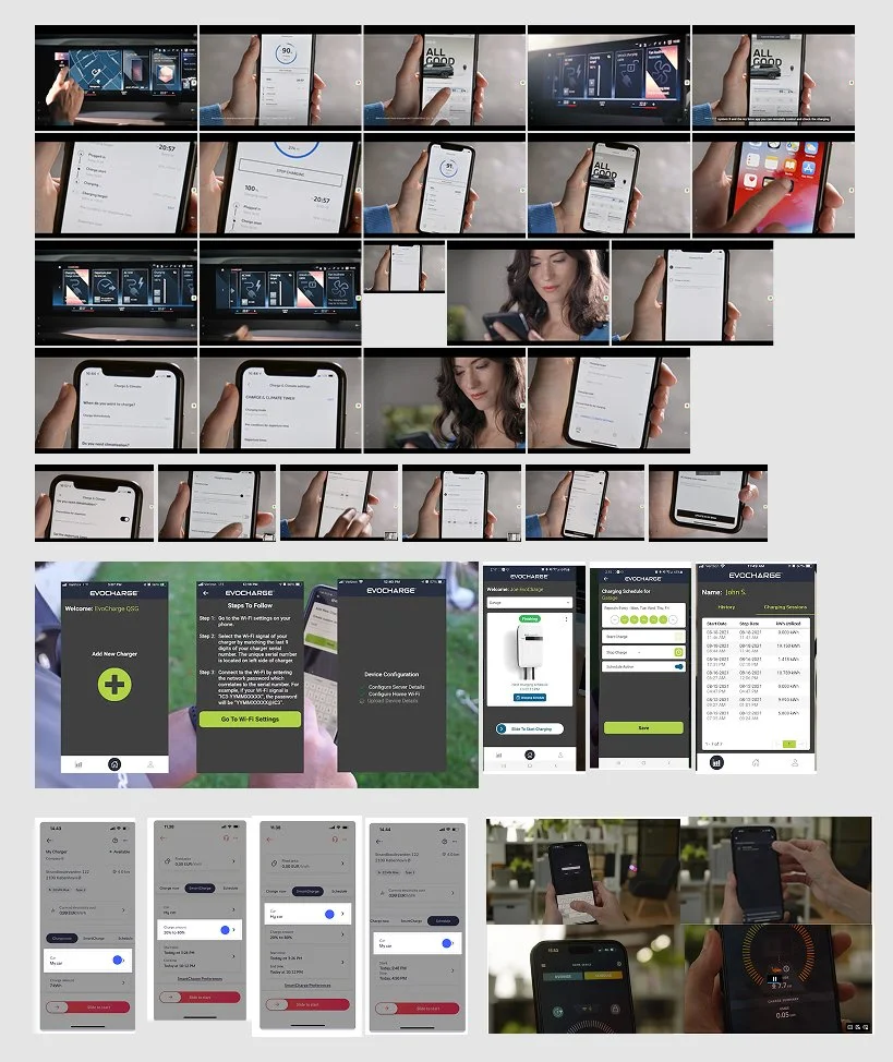
01. Discovery & Competitive Audit
Together with a junior designer, I reviewed key European EV charging apps via demos, websites, and UI references.
What we set out to learn: What we set out to learn
Through competitive audits, we aimed to understand how other charging apps communicate state and trust.
Despite different design approaches, most relied on purely technical indicators (LEDs, icons, logs) without clear states and emotional cues.
This revealed an opportunity — to bring more real-time feedback and emotional clarity into our experience, especially around state transitions and fault recovery.
These insights later informed both our interaction model and visual tone, designed to feel calm, legible, and reassuring.
02. Early Signals to design focus
I built a scenario map to align the team on key usage contexts — not only designing by feature, we also want to cover designed by situation.
This approach helped us consider each scenario holistically — combining user emotions with technical behavior — especially under special or edge conditions
👤 Scenario 1
Quick plug-in after work — fast and frictionless

👤 Scenario 2
Scheduled overnight charging — reassurance that timing and power flow are correct

👤 Scenario 3
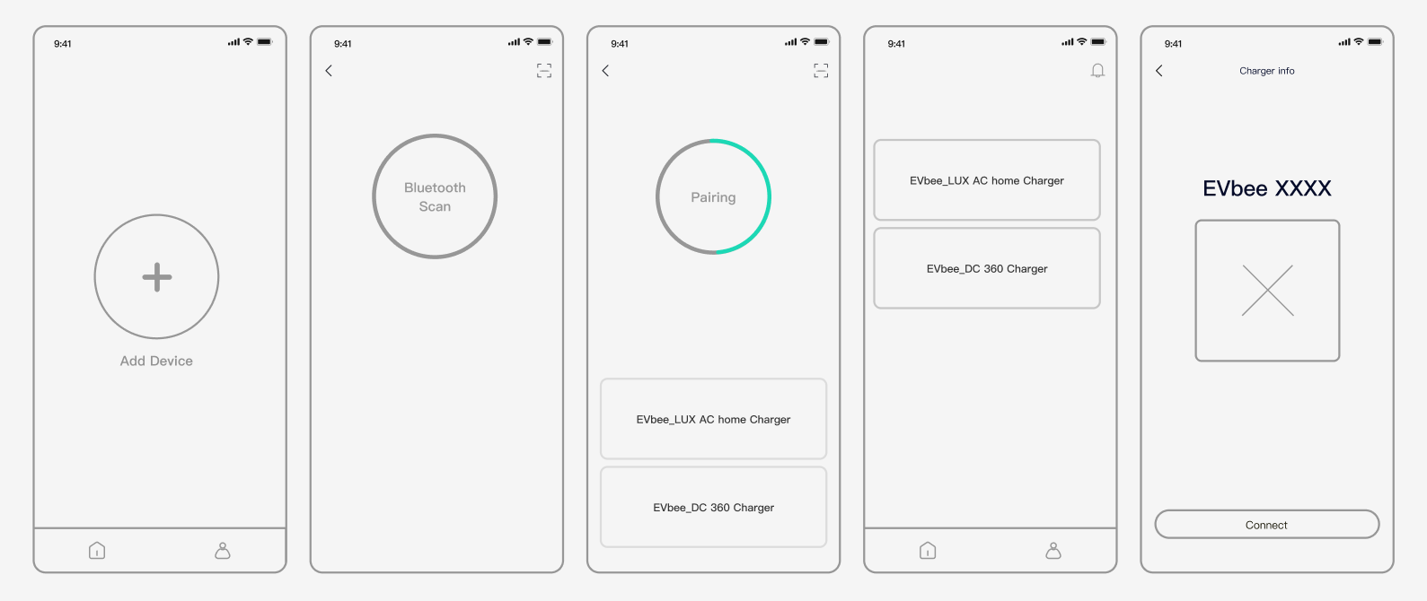
First-time setup — seamless onboarding, especially around pairing
👤 Scenario 4
Low-signal scenarios (e.g. basement) — smooth fallback to Bluetooth or offline mode
03. Design Hypotheses (What we believed would improve the experience)
Based on the four key usage scenarios, we formulated a set of working hypotheses to guide our design direction:
State feedback hypothesis — If every system transition is clearly named and visualized, users will spend less time hesitating or retrying during charging setup.
Trust reassurance hypothesis — If we use calm tone, color, and motion to communicate progress, users will feel more confident even when hardware feedback is minimal.
Error recovery hypothesis — If fallback and retry paths are surfaced early, users will regain control faster when facing signal or pairing issues.
These hypotheses helped us frame the emotional mapping in the next phase — focusing on where anxiety peaks occur, what feedback is missing, and how to transform those moments into reassurance and flow.
04. Charging Flow with Emotional Mapping & Hypothesis
To explore these hypotheses in context, we mapped the end-to-end charging journey — linking each system state with user emotions to uncover friction points and design interventions.
For each transition (e.g., Cable detected → Handshake → Ready → Charging), we marked anxiety peaks and confirmation needs, then defined design interventions (tone, motion, pacing, fallback) to reduce emotional friction while keeping hardware logic intact.
This gave us a prioritized list of critical design nodes and the interaction system they require.
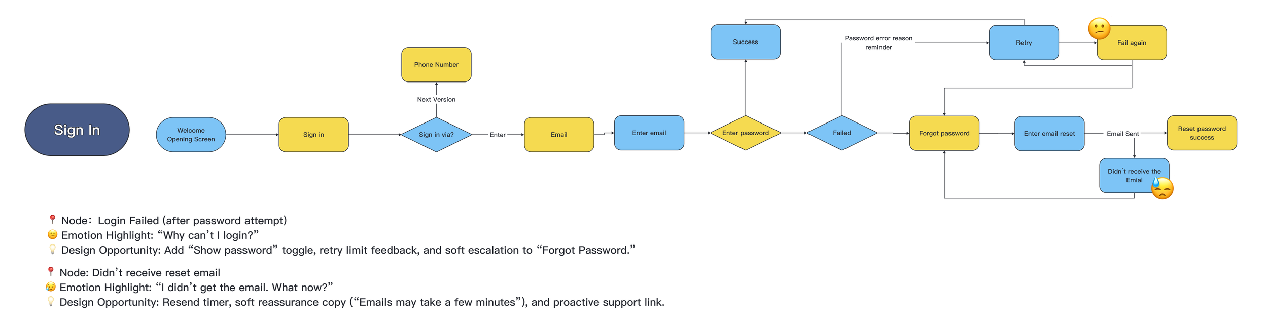
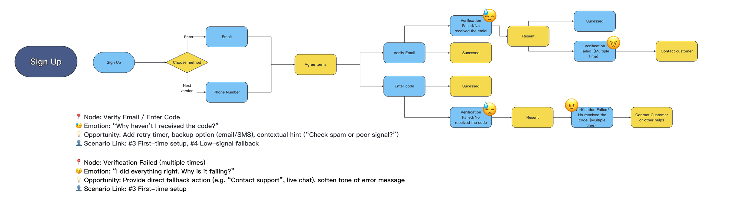
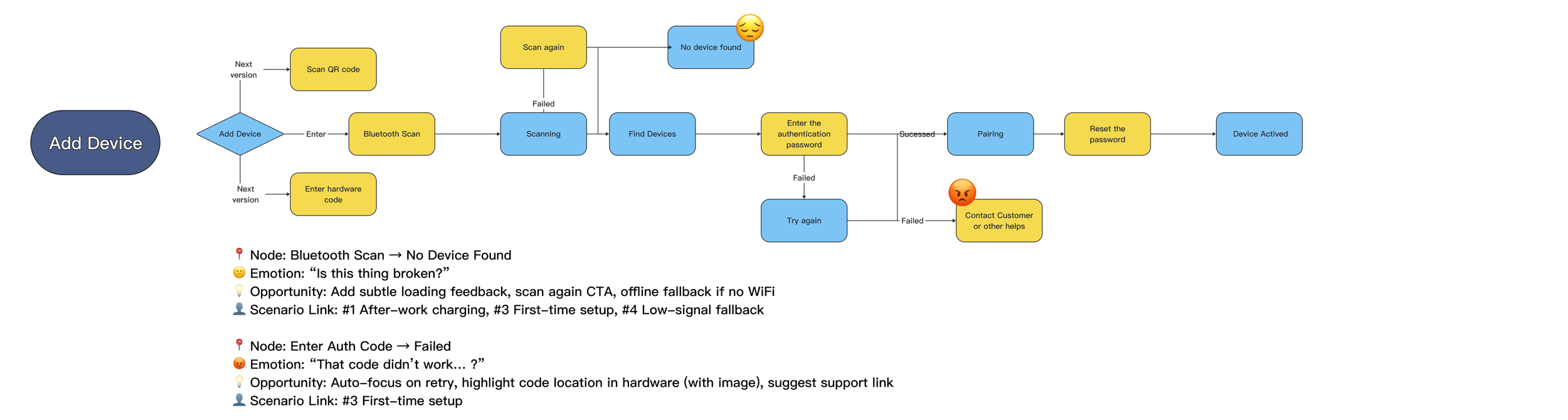
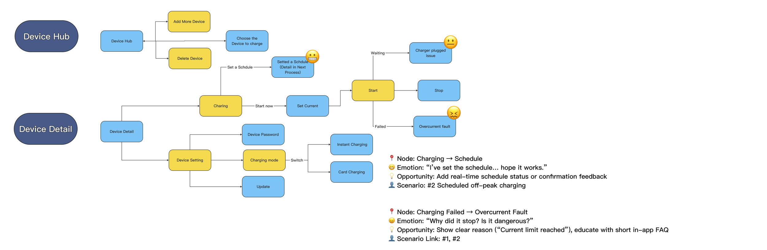
🌟 Each state was designed not only for what it does, but for how it feels — aiming to reduce anxiety and create a sense of calm, predictable flow.
This mapping became the backbone for later interaction and animation design, helping both design and engineering align on how each signal should “feel right” in real time.


From Insights to Strategy
Bringing together insights from competitive audits, early signals, and hypothesis mapping, we translated our learnings into three design strategies that guided the entire product system.
They weren’t just UI decisions, but product-level principles connecting hardware logic, interaction, and user emotion.
State transparency – Every key action should return a visible, meaningful response (e.g. “Cable detected”, “Handshake complete”, “Charging in progress”).
Emotional reassurance – Use motion, tone, and pacing to communicate calm progress rather than technical noise.
Recovery readiness – Anticipate and gracefully handle edge cases like low-signal or pairing failure, ensuring users never feel “stuck.”
Together, these strategies transformed our findings into a scalable design system — one that makes invisible technology feel trustworthy, predictable, and emotionally human
Success metrics we looked for
↓ Time-to-first-charge
↓ Premature unplug / retry rate during handshake
↑ Confidence & clarity — fewer “is it charging/did it connect” moments observed in internal feedback and support logs
Validation under Constraints
With limited resources and testing dependent on real hardware interaction, we focused early efforts on walkthroughs of key user flows to align logic and system states.
The first real validation took place after development, before animation refinement — confirming that clearer state feedback and calm pacing significantly improved user confidence.
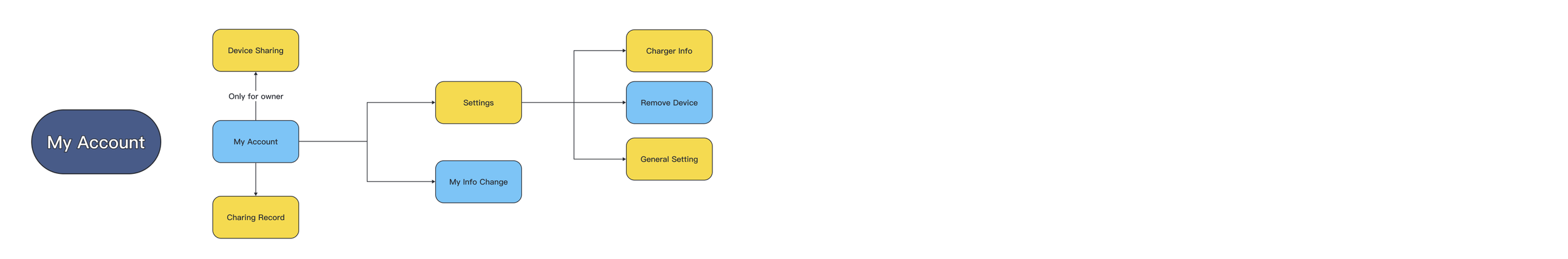
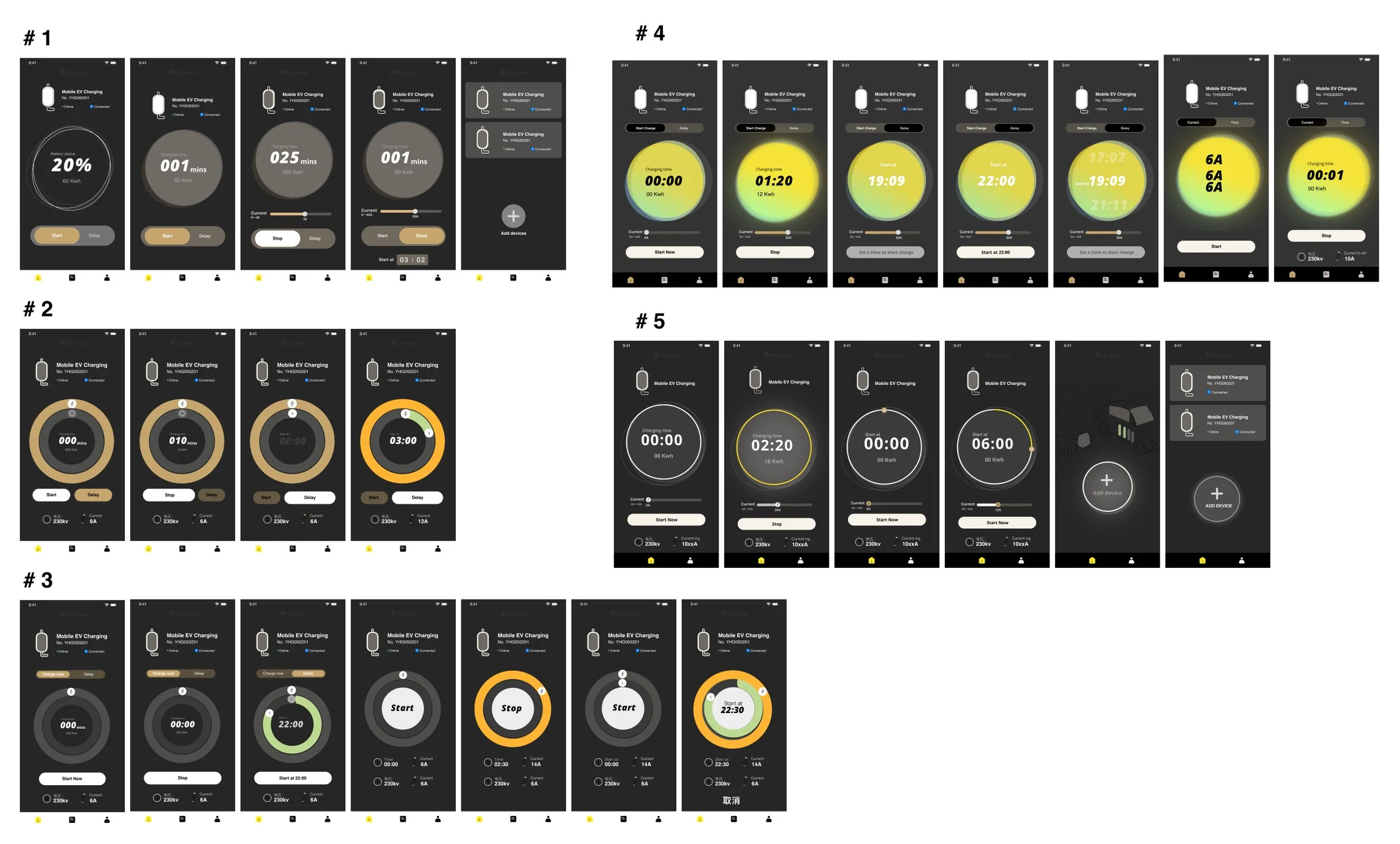
Key flow Wireframe
UI style guide
With only a basic brand foundation, I had space to explore.I proposed five visual directions based on curated references and design benchmarks.
Direction #5 was selected — setting the tone for the final experience.

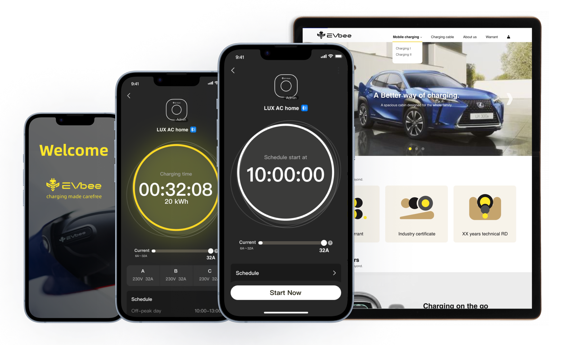
Final Design result highlights:
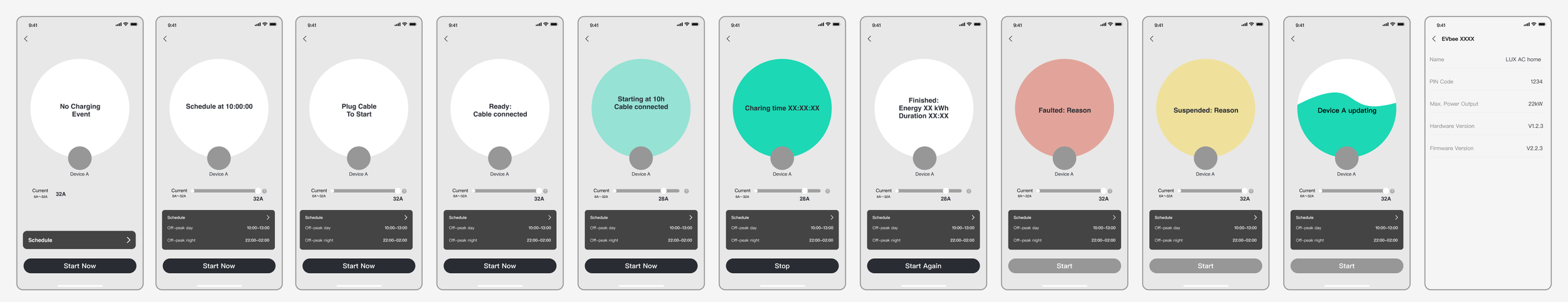
1.Immersive Visual States for Trust and Clarity
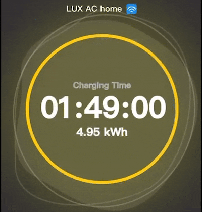
To build clarity and trust, I designed a UI system based on charging states — using color-coded rings to show progress instantly.
A central analog dial combined time-setting and status feedback, simplifying decisions and making the flow feel intuitive.

2. Comprehensive State Mapping
We broke the charging journey into clear, sequential states:
Scanning → Pairing → Ready → Charging
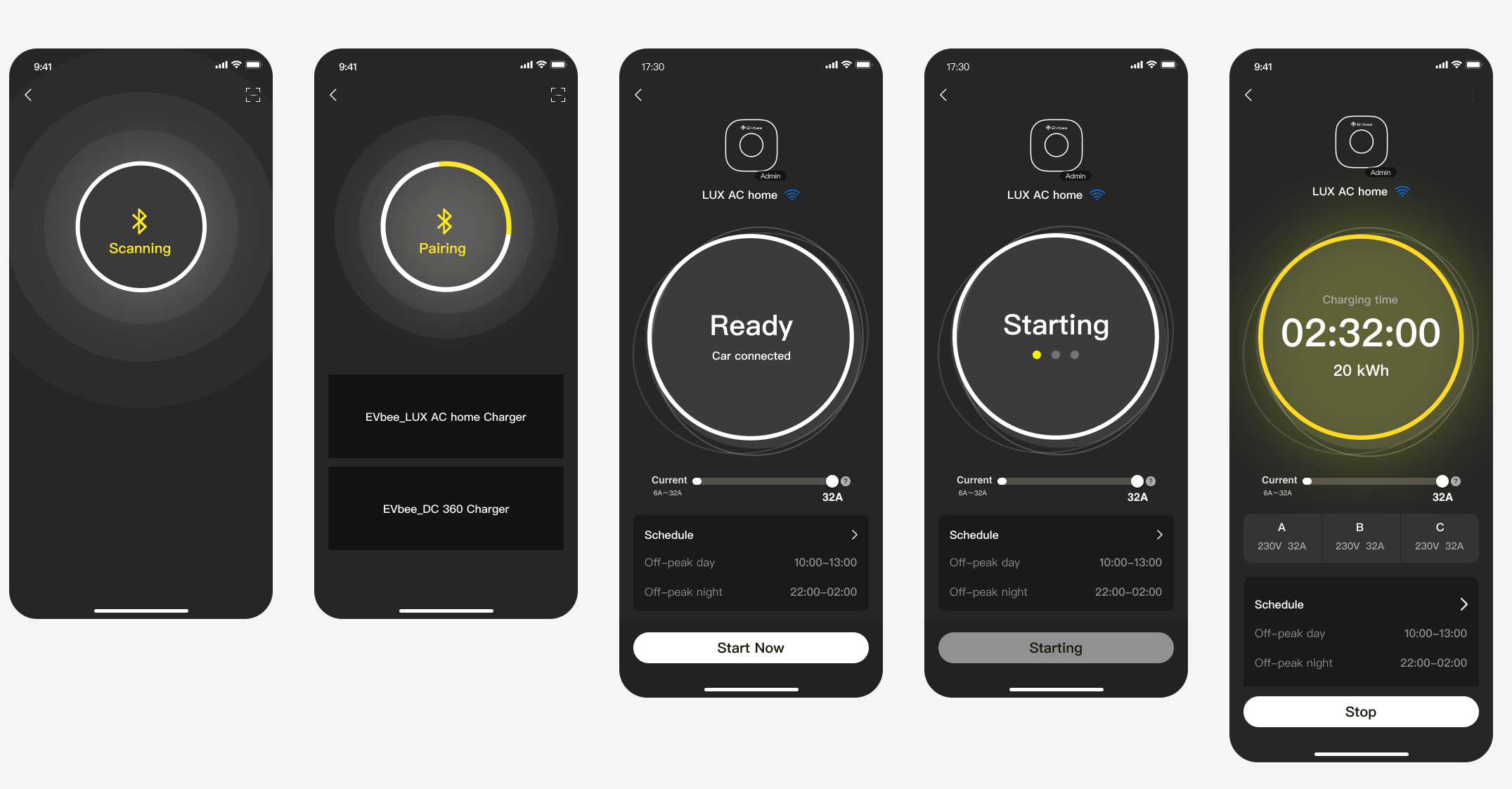
→ “Suspended” → “Faulted” → “Updating”

3.Motion as a Communication Tool
We used animation to express system behavior more clearly:
Pulsing ring = scanning
Breathing dial = charging
Fading transitions = visual continuity
These subtle motions turned technical states into a sense of flow and quiet trust.


Visual System — Building from Icons
We started with icons as the foundation — flexible enough to work across both app and hardware.
This became the entry point for building a scalable, state-based component system.
Trade off
Validation Timing vs Technical Feasibility — Meaningful testing required real hardware, so we focused on logic alignment early and validated once the functional prototype was available.
Clarity vs Simplicity — Limited visible states to 3–5 key phases, using motion for micro-states.
Speed vs Assurance — Added brief confirmation for first-time setup, skipped for returning users.
Realtime vs Performance — Moved to event-driven updates with short transition polling.
Metrics
Although formal research was limited, we tracked early internal signals and used market benchmarks as reference points:
Setup completion time: reduced from ≈5 min (typical market average) to ≈3 min
Support questions “Is it charging?”: notably fewer after UI integration
Adoption: well above internal expectations for a 0→1 launch
What I Learned
Alignment takes intention. Shared visuals — flows and storyboards — kept design, hardware, and engineering aligned.
Clarity builds trust. Even when nothing moves, good feedback makes users feel secure.